Categories

Showing posts with label Color Talk. Show all posts

Oct 27, 2019

New Neutrals

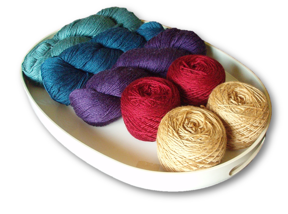
It's been quite some time since earth tones have grabbed the limelight, but based on the clothing and accessories appearing on fashion runways and in major stores, they're back. Big time.


Rich, chocolate browns are being paired with their traditional siblings such as milk chocolate, tan and sand, as well as spicy shades of tumeric, ginger, chili pepper, pumpkin, rust and burgundy.


In other words, all the classic fall colors are once again right on trend. If the loooong reign of cool neutrals has left you out in the cold, now's your chance to find the yarns you're seeking in the warm tones you love.


RELATED


Jul 7, 2019

Winding the Rainbow

We've had so much rain lately, I can't recall the last time we had a clear, sunny day. To combat the gloom, I've been gradually winding the rainbow yarn. 

The rich, saturated shades are the perfect antidote, and the touch of silk imparts a sheen that's especially appealing when the skies are gray.
This yarn is destined to become a shawl or wrap or cowl or some combination thereof, so while I wound, I took the opportunity to play a bit with color options. The assortment above features five colors (no magenta), for example, while the others feature six. 

I freely confess I lingered over the caking process, partly to simply wallow in this soothing task and partly to think through some issues I'm having with one of the designs I'm working on. 
Now that all the yarn is wound, I'm chomping at the bit and eager to cast on, but hopefully cooler heads will prevail. Several projects either on the needles or in the final finishing stages could in a relatively short period of time go from WIPs to FOs, if I could simply muster the discipline to make it happen.

Jun 16, 2019

No Regrets

Not long ago, I ordered yarn for what will hopefully become a light-weight, season-spanning shawl worked in a rich rainbow of vibrant gemtones. (Charlemont by Valley Yarns)


Because the price was right and online color selection can be tricky, I included a safety skein of a subdued purplish shade in case some skeins refused to play well together. It's a perfectly lovely color, but as you can see, it's significantly softer and less saturated than the ones above.


While I have no clue what I'm going to do with this lone singleton, I have no regrets. With 439 yards to play with, there's plenty of latitude to either use it on its own or pair it with another wayward orphan or odd ball from stash. I'm willing to live with that uncertainty for now, while I focus on swatching and casting on the next big thing, my rainbow shawl.

May 19, 2019

Knit the Rainbow

Our weather has been all over the place. Gray and gloomy. Violent and stormy. Cold and damp. The occasional mild, sunny and inviting days have been so rare, it's clearly time to take matters into my own hands.

When this lovely yarn (Valley Yarns Charlemont) went on sale, the cosmic timing was too perfect to resist. I'm going to knit the rainbow.

I've worked with this yarn before (Dojeling Wineberry wrap), and it has a nice hand, soft sheen and wide range of colors. It also has a healthy 439 yards per skein, so the six skeins below offer loads of options.


While I've not yet decided on a specific design or pattern, I'm certain of one thing. This yarn is destined to become a shawl or wrap, because next to fingerless mitts, they're the handknits I wear most often. In this yarn weight and fiber mix (merino, silk and nylon), the finished piece would be the ideal weight for spring, summer and fall.

Even better, when back-to-back gray days become too much to bear, I can wrap myself in a rich, vibrant rainbow and chase the gloom away. 


Want to see more posts on rainbow knits? Click here and your wish will come true.

May 6, 2019

Binge Swatching

For better or worse, my binge swatching streak has continued. It's not that swatching isn't productive, it is. But couple that with a fondness for color play and what-if scenarios, and a full-blown obsession can't be far behind.

In other words, I'm still preoccupied with the syncopated slipped rib stitch in all its forms. It handled the highly variegated Happy Feet so well, I found myself scouring the stash for similar short-print yarns. Eventually, I discovered a single skein of Panda Cotton (Crystal Palace), which rapdily cycles through several shades of blue punctuated with a stretch of black. 


Since one key to taming busy variegateds is to add a closely related solid, I first tried pairing Panda with black Tajmahal (Filatura Cervinia). This combo created interrupted stripes, a look I initially didn't care for, but it's grown on me. I can see how over the course of a larger piece, the irregular stripes could make a simple shawl or cowl dynamic and visually interesting. Working the variegated Panda with a solid blue (Zaffiro by Madril Yarns), minimized pooling but caused the vertical stripes to virtually disappear.

I could've cheerfully continued working through every variegated yarn in the stash, but decided instead to experiment with some color blocking. I've always loved purple and red together, so I combined black (Tajmahal) with violet Aspen (Baah) and burgundy Charlemont (Valley Yarns). The slipped stitches produce an interesting notched or serrated transition from one color to the next, an effect I rather like.

And therein lies the problem. From jewel tones to neutrals, my stash is filled with many lovely skeins that might lend themselves to this technique, which means my fingers are itching to start (yet another) series of swatches.

Perhaps it's time for an intervention.

Apr 28, 2019

Swatch Stories: The Saga Continues

In retrospect, it was totally inevitable. What began as a quick experiment turned into much, much more. 

It started quite innocently, as these things often do. My initial objective was to work a series of  small swatches to demonstrate how very different the same stitch can look in various yarns and color combos. The swatches featured the syncopated slip stitch which can be used to create vertical stripes.

One swatch was worked in the two deepest shades from the ombre mini-skein set above (Mad Hatter Shillings & Pence by Wonderland Yarns). The result was attractive but understated, because the vertical stripes were almost indiscernible in such closely related colors.

And this is where things began to go sideways. There are plenty of projects on the needles clamoring for attention, but I simply couldn't resist taking the experiment just one step further. So, I paired the medium shade with the lighter of the two deepest colors, and worked another section.


Uh oh, that new section looks rather appealing. Surely I should try just one more combo and blend the medium with the second-lightest shade, just to see what happens?
Well look at that, the third section is also attractive, perhaps I should just keep going? For one full day, I held firm. Then I buckled and started working the last section with the two lightest shades.
The good news? I love the overall effect, and for sheer versatility and stashbusting potential, this stitch is definitely a keeper. 

The bad news? The Mad Hatter yarn is technically slated for a different project, but I may have to rethink that plan. Meanwhile, I'm already searching through the stash to see what other yarns and combos might lend themselves to this approach. 


The reality? The saga continues. (And I see lots of swatching in my future.) 

Apr 15, 2019

Same Stitch, Different Looks

Something as simple as changing yarns and/or color combinations can completely transform the look and feel of a project. That's only one of the many things that makes knitting both fascinating and challenging.

For example, I have as you know been somewhat obsessed with this charming little slip stitch. It creates an appealing texture that's almost-but-not-quite rib-like. In solid shades, the spotlight remains on the texture.

Add in a second color, however, and this simple stitch takes on fresh interest. It's a quick and easy way to produce vertical stripes that resemble corrugated ribs, but it offers more advantages. The fabric is stretchy, and the stripes are worked without the fuss of stranding. With two contrasting colors worked in a springy worsted merino (Valley Yarns Amherst), the stripes are clearly defined.


If you pair a variegated yarn (KFI Indulgence Eggplant) with a high-contrast solid (Sugar Bush Bliss Platinum), however, the vertical stripes take on a new dimension. Because Indulgence features slow or long-print color changes that shift from eggplant to plum and rose, the transitions create an interesting gradient effect.


Work the same long-print variegated with a tonal yarn in a compatible shade (Baah Aspen Violet), and the results are quite different.


To tame a yarn that's prone to pooling, work a rapid color changing variegated (Happy Feet Berries) with a closely related solid (Valley Yarns Charlemont Burgundy). Because the colors blend together, the vertical stripes are still visible, but they're much more understated.


Or you could really get carried away as I did, and match two very closely related tonals (Wonderland Yarns Mad Hatter Shillings & Pence) for vertical striping so subtle, the two shades are almost indistinguishable.


Life and work have been demanding in ways I won't even attempt to describe, so as you can see, I've been knitting swatches as a small but invaluable diversion. Each one uses the same syncopated slip stitch worked in a variety of yarns to demonstrate some of the many possibilities when you let color do much of the work.

Mar 10, 2019

Ombres (not Hombres)

Every time I search for information related to ombres and gradients, Google very kindly suggests I might want to search for hombres instead. As thoughtful as that suggestion is, it's not terribly helpful, since I continue to be obsessed with ombre effects and the many fascinating ways they can be created in knitwear.


Pattern | Healdan Scarf
The easiest way to create an ombre is to simply buy a gradient yarn, pick a pattern and work it up, right? That was my initial intent when I invested in this Mad Hatter Shillings & Pence (Wonderland Yarns by Frabjous Fibers).

So much for plans. 

Once I had the yarn in hand, I realized I wanted something that leveraged the wonderfully subtle color transitions the dyer managed to achieve. To accomplish this, I needed just the right stitch, one that was easy to work but which created a smooth segue from one shade to the next.


Unfortunately, that means I've been spending more time swatching than knitting. This is frustrating, because right now, I'm not just eager, I'm desperate to cast on a shawl or wrap that can carry me through the remainder of winter and the wet, chilly spring so typical in this region.


I worked the swatch above in just two colors. The top portion features the lighter shade, the bottom shows the medium shade, and the center is worked in alternating rows of both. I like the weight and drape, and the slightly syncopated texture which helps break up the transition rows and visually blend the colors.

I'm off to figure out a few more details, then maybe ... maybe ... I'll be ready to cast on.


To see all ombre and gradient posts, click here.

Feb 3, 2019

Color Does All the Work

Not long ago, I stumbled across a Kaffe Fassett profile in Let's Knit Magazine. (It's well worth the read, so I hope you'll take time to check out the link.) 

I've never knit one of his designs, but I've admired his work for longer than I care to admit. Like countless others, I've always found his jubilant use of color inspiring, albeit a bit daunting with all those ends to weave. Much of what he shared in the profile resonates, but one quote really captured my attention:
Because my main interest is colour I feel no need for fancy stitches like lace and raised textures. The colour does all the work, particularly in good pattern structures ... 

Whew, what a relief! 

While I admire and respect knitters who delight in intricate shapes and complex lace or cable designs, these are not the things that continue to fascinate me after decades of working with needles and yarn. 

Instead, I'm drawn to designs that feature simple shapes, subtle textures and a focus on color. I'm not now nor shall I ever be in Kaffe Fassett's league, but if pursuing these qualities is good enough for him, then it's more than good enough for me.


To see all posts related to color, click here.

Jan 27, 2019

Living Coral: Color of the Year

Every year, the color experts at Pantone designate a color of the year. For 2019, they've chosen Living Coral (16-1546), a color that hovers somewhere between apricot/pink and peach.

Trend-watching isn't my thing, especially in knitting. I prefer to make what I want in colors and fibers that appeal to me, regardless of whether or not they're on trend. In fact, one reason we choose to knit, crochet, sew and weave is to create specific items that reflect our personal tastes and preferred color palette. 

That said, I always find it interesting to peruse projects past and present to see how often (if at all) a hot-right-now color appears.

Initially, the only project that came to mind was this version of Herlacyn, which features a soft coral worked as part of a diagonal gradient that shifts from banana and butter yellow to warm pink, fuchsia and red.


Then I remembered this project, where soft coral also appears in something every knitter needs, a quick pair of spring-weight mitts worked in gradient shades that match the new afghan.


A deeper dive turned up this rainbow Valere, which has a coral banner positioned top and center.


Its sibling incorporates the exact same coral in the same location (top center), but it's taken on a pinkish hue due to different lighting conditions and the other colors surrounding it.


In Twegen Harvest, the third and fourth strips pair coral/peach speckled yarns with light and medium clay for very different effects.


That's not a lot of projects, but I was surprised to see hints of coral and apricot have been been surfacing in my knits for awhile. I would never knit a specific color just because it's fashion forward, but Living Coral is attractive and versatile. This might be one time where the color of the year deserves to be highlighted in a project of its own.


RELATED


Dec 9, 2018

Possibilities

Earlier this year, I was rummaging through the stash searching for inspiration when a few variegated skeins caught my eye. I quickly put together some working combinations, including this version that emphasized the red, rose and plum shades in the variegated yarn.


That's as far as things progressed. Then a couple weeks ago, I realized there were several skeins of a lovely soft platinum grey (Sugar Bush Bliss) lurking in the stash. The limited yardage restricted project options, but it occurred to me if the colors worked, it might serve as a nice foil for the variegated yarn (KFI Indulgence).

Once I opened up to the possibilities, one thing quickly led to another, as is so often true where knitting is concerned.


The initial swatch using my new-favorite slip stitch turned into the first of a pair of fingerless mitts. The cool platinum created solid vertical stripes that to my eye play nicely with the lateral bands of color produced by the long-print variegated yarn.


As soon as the mitts were bound off, I cast on for a matching scarf. My original plan was to go long and skinny, a shape I find especially versatile, but then I realized something intriguing. If I turned the long scarf into something more compact such as a cowl or neckwarmer, I'd have enough yardage to make a shawl, which I desperately need now that cold weather has settled into our little valley.

The holidays are just around the corner and there are a bazillion things I should be doing. Instead, I suspect I'll spend the evening snuggled under a warm, wool afghan, knitting a soon-to-be shawl.  


Connecting with the linkups in the sidebar.

Oct 21, 2018

Ongoing Obsessions

It was bound to happen. Between cool weather and my ongoing obsessions with neutral colors, gradients and ombres, my current need for more mitts had only one logical outcome.


Friday, I cast on a fresh pair in soft, warm worsted weight wool, even though there are several WIPs lingering in the background. I've made progress and would have made more, but three-quarters of the way through the first mitt, I decided I wanted it longer. So, I ripped back and added some additional length to each section.

To justify ignoring the WIPs, I opted to turn this into a stashbuster project. I limited the color palette and decided to work a simple, three-stage ombre with medium and charcoal grey leftovers from my Tikkyn Flagstone afghan


Meanwhile, I'm loving this particular slip stitch rib, which is stretchy, easy to work and somewhat magical (with a few minor changes, you can create very different effects). I'll share some examples of this one day soon, but for now, I'm eager to finish these, so I can pop them on, and cast on another pair.

What knitting obsessions are you indulging this week?


Connecting with the linkups in the sidebar.

Sep 30, 2018

Nifty Neutrals in Action

Last week to ease our way into the fall season, we took a look at nine nifty neutral color combos. As a result of that post, I began browsing through completed projects to see where and how neutrals have surfaced in the past, so this week, I thought it might be helpful to share some neutral combinations in action.

Drumlin Almost Neutral: Black, slate and cream with a pop of red


Tikkyn Flagstone: Light, medium and dark greys with burgundy


Kintra Nearly Neutral Cowl: Black, grey and cream gradient with red


Kintra Nearly Neutral Mitts: Black, grey and cream gradient with red


Kintra Greyridge: Dark, medium and light grey ombre


Grey Daze Mitts & Shawl: Cool grey and cream with burgundy


Wyndfael Mitts: Charcoal and cream with red


Pewter and charcoal with red


Twegen Coffee: Black, grey, brown, toffee and cream


Owl Family: Chocolate, toffee and brown speckled yarn accented with gold


Hopefully, if you're one of the many knitters who have difficulty visualizing how colors will interact in a finished project, these examples will serve as a starting point for one of your own projects. Looking through them has certainly prompted some insights for me.

It's clear, for instance, that when a neutral project needs a spark of bright color, reds and burgundies are my go-to choice. At one time, browns and earth tones would have featured more prominently in any neutral roundup, but most of those projects were completed not just pre-blog but also pre-Ravelry, so no pictures exist. Many were sweaters, including a taupe tunic, a tweedy pullover accented with warm peach, and a lovely cardigan for my sister in shades of dark chocolate, mocha and caramel.

I have a small project on the needles right now, but as soon as it's finished, I plan to rummage through the stash, choose a few select skeins, and start swatching something subtle and understated in an interesting mix of neutrals.


The project links above take you to the FO post. If you're interested, you can find the patterns here.